UNDERSTANDING MOBILE INFORMATION DESIGN
The visual display of information is how people connect with loved ones, colleagues, and friends. It is how we know our gas tank is almost empty or that we can cross the street. Mobile devices offer an exciting space to design information, fitting personalized and real-time data into tightly-constrained screens. But keep audience goals in mind when crafting an application, because mobile devices are not generally used for extensive browsing or complex searches.
Information Display:
A microwave has a simple display. When the timer alerts us the popcorn is done, we can check to see if the bag looks adequately puffed, and then open the microwave door and popcorn bag to start eating. People identify signals, interpret the meaning of these signals, and determine the goal according to these interpretations, and then carry out an action until the goal is reached. Go beyond returning user-requested data, and choose a personality that sets an application apart. The power to charm users can overstep redundant applications in industry-standard markets. Overly detailed designs do not suit mobile users.
Design Patterns:
Hardware and operating systems become irrelevant far quicker than design that reaches users. A design pattern recycles and repurposes components, reusing the best ideas.
Navigation:
Good design makes it clear how users can move through and use application features.
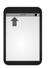
Annunciator Panel:
An annunciator panel, gives information on the state of a mobile device. Though each mobile device will provide a slightly different panel, developers can modify or suppress the annunciator panel — which lists the hardware features such as network connection and battery power — within an application. Because the information in this area is only notifications, application users will not usually have any direct interaction with the annunciator panel.
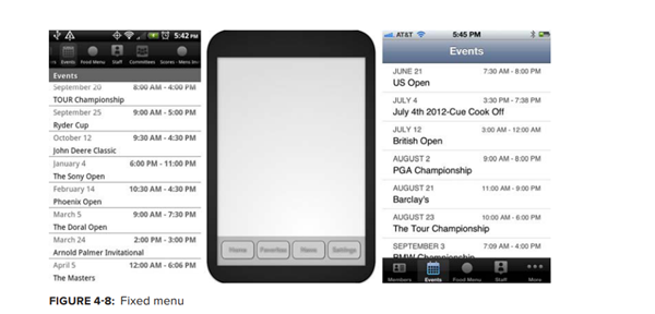
Fixed Menu:
A menu that remains fixed to the viewport as users roam content is useful in many situations
- When users need immediate access to frequently selected functionality on multiple screens
- When a revealable menu is already used on the same screen.
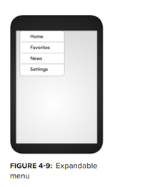
Expandable Menu:
When all function options for one page cannot fit on the viewport, an expanding menu can provide selectively available options. A gesture, like a swipe or double tap, may prompt the reveal as well as selecting an on-screen icon. Users may exit a menu using a back button, a close button that is part of the revealed menu list, or by toggling with the same gesture.
Scroll:
As in the case of a revealable menu giving additional functionality, there will often be more content on a screen than can be seen in the device viewport. It is best to limit scrolling, limiting application screens to the size of the viewport whenever possible. Easy navigation keeps people connected, instead of losing users to navigational frustrations. Only in-focus items should be able to scroll.
Related Other Post
Notifications and Feedback:
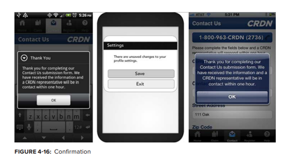
If the user needs new information, application creators must use notifications. These prompts pause ongoing tasks, and enable users to change processes and behaviors according to the new information or feedback. Feedback is the user-perceived result of an interaction, providing immediate confirmation like a color change, message, or being led to a new page. Delayed feedback leads to user frustration and redundant, often error-inducing input; confirmation feedback is useful when user data could otherwise be lost.
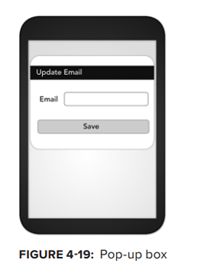
we can display content either as a full page or revealed in context. When we use a full-page layout, the user should not need to constantly bounce back and forth between pages. If content might help users decide how to proceed, a quickly revealed, in-context design (such as a pop-up box) may be the better design choice
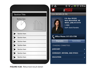
Display a range of information, from graphics to text, in an array such as an ordered list.
Display a range of information, from graphics to text, in an array such as an ordered list.




0 Comments
if u have any doubts please let me know,